Ferrari Roma Interior
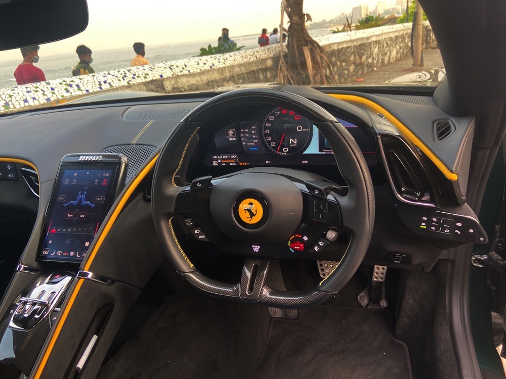
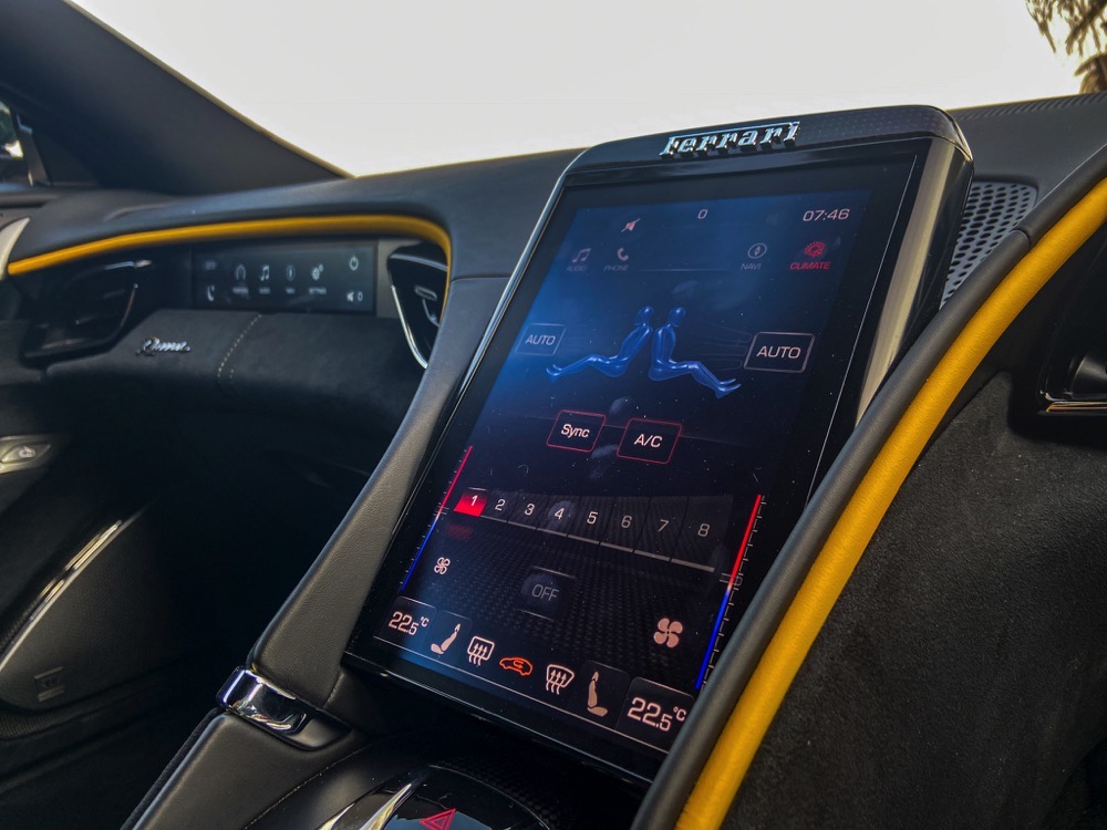
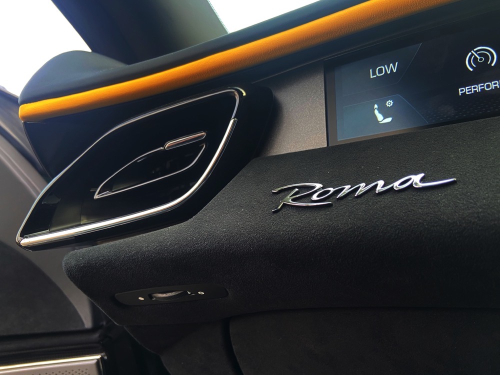
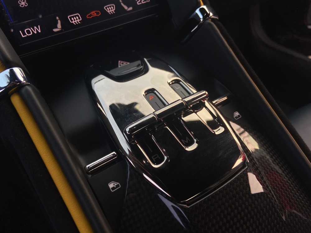
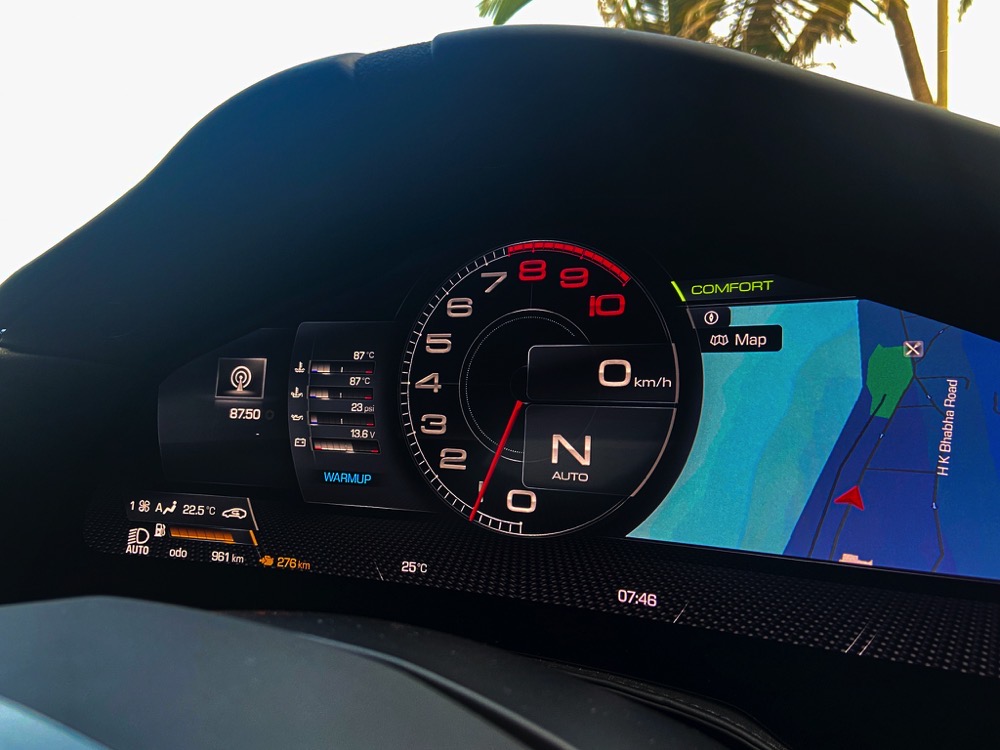
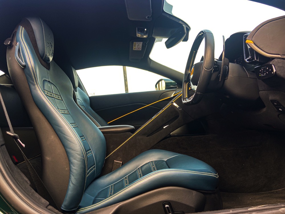
Step inside the Roma and you are welcomed by a Ferrari interior of the digital age. The instrument cluster is a TFT screen, and yes the large tachometer sits in the centre just the way I like it. Only thing is that it is digital now and not an analogue dial. The new flat bottom steering is meaty and nice to hold and I love the full length paddle shifters. You will also notice how everything has gone touch here. The physical engine start/stop button is gone and instead, you just push a touch button on the steering and that will start the car. Same goes for scrolling through the instrument displays. Everything is just touch, both on the left and right of the steering. Even the ORVMs are adjusted by touch and I honestly felt it fidgety to use. It certainly takes time getting used to and I am not a fan at all. The cabin feels divided into two zones split by the centre console. There is a vertical tab like screen right in the centre which is used adjust the climate control. Again it needs getting used to and can be an issue to play with while driving. On the centre console, you see something that resembles a gated shifter, only difference being it has controls for gearbox modes and launch control. Very retro looking and super fun to operate. Another new thing is that there are buttons to open the doors. There is no lever. On the passenger side, you get a screen and chrome Roma badge above the glovebox. There are few storage spaces as well which can hold you phone as well as a cup holder. The front seats are very comfortable and have excellent support. The interior of this example was very well appointed and I loved the yellow piping all around. The rear seats are too small even for kids, so while on paper it’s a 2+2, realistically it is a two seater at best. Coming to the 272 litre boot, it will easily hold a couple of mid-size bags for those weekend getaways. There is no spare tyre though, but Ferrari will gladly sell you one.
