Toyota Urban Cruiser Interior
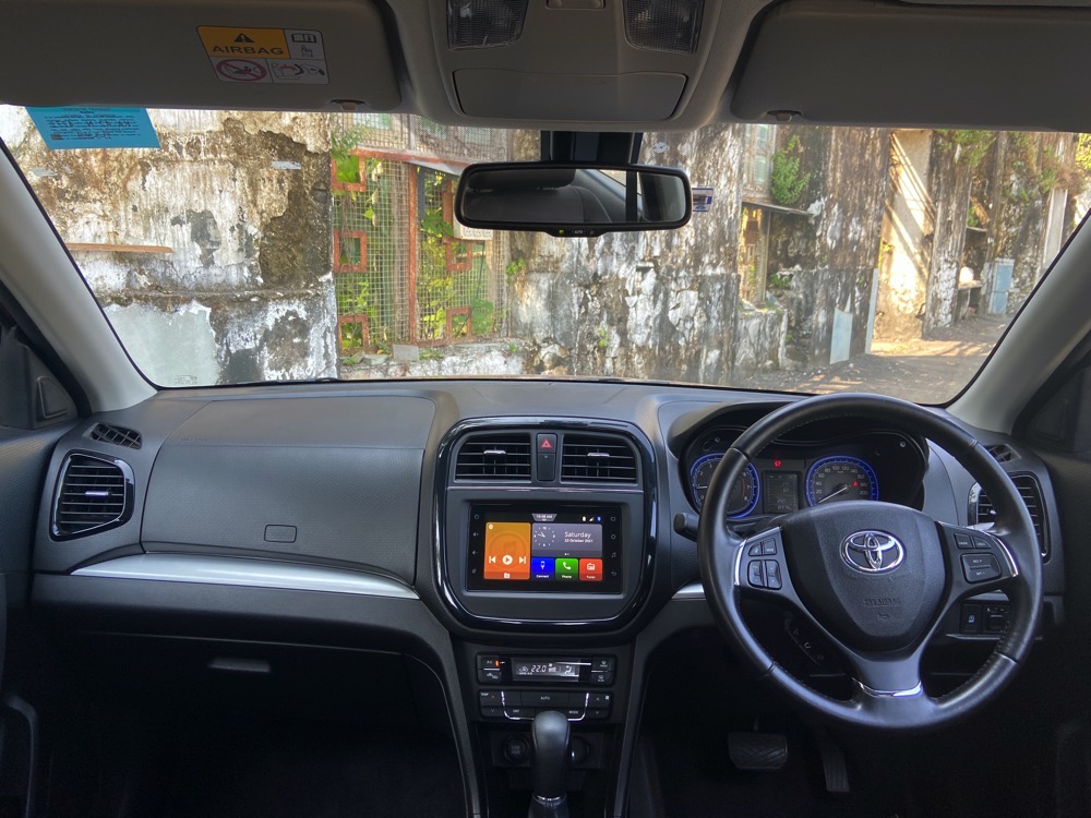
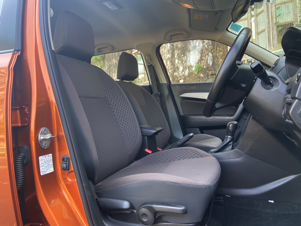
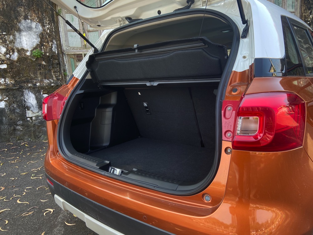
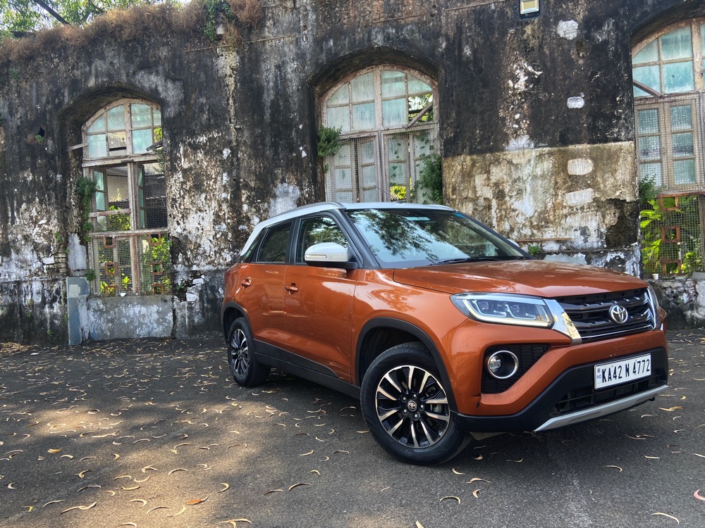
Step inside and the interior is exactly the same as the Brezza. The dashboard layout is clean and functional. It does however look dated compared to its rivals, and fit and finish could have been better at places. The steering wheel gets a Toyota logo in the centre, and the seats and door inserts are in a different colour. The seats are comfortable and even space at the rear is good with ample knee room and headroom. The high set seats are also an advantage for ingress and egress. I quite liked the high driving position as well. There are a good number of storage spaces around but missing rear AC vents are a downer. The 328 litre boot is nice too and pretty deep. Plus the rear seats can be folded down in a 60:40 split as well.

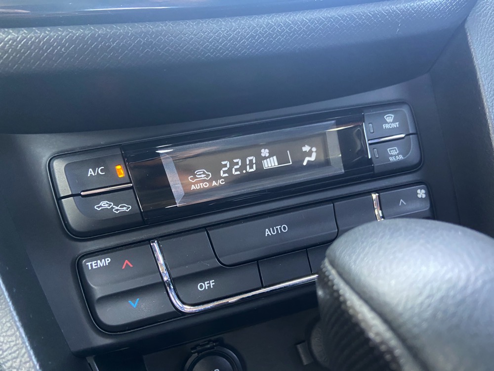
As far as features go, the Urban Cruiser gets a 7 inch touchscreen with Android Auto and Apple Car Play (the Toyota logo pops up at start up instead of the Maruti one), auto climate control, auto headlamps, cruise control and rain sensing wipers. It however misses out on a sunroof, side and curtain airbags, traction control and connected car tech, which have become the norm today.
