Maruti Suzuki Celerio Interior
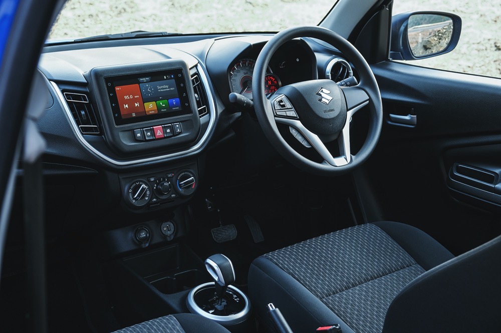
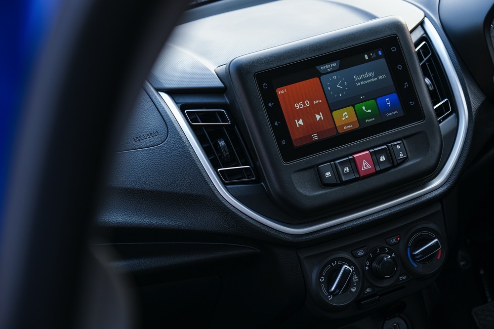
Things are nice on the inside too. There is a freshness to the cabin and the interior looks modern and stylish. The dashboard is well laid out, and you get a part digital instrument cluster. The dashboard gets a nice texture on the top too. The 7 inch touch screen with the Smart Play infotainment system sits right in the centre, and the front power window switches and the central locking button are located right below it. I personally prefer the power window switches to be on the door itself or on the centre console below. The cabin feels much more premium than the earlier car, but there are no soft touch surfaces, only hard plastics. I also liked the design of the AMT gear lever, quite sporty and nice to hold. This top end ZXi+ features keyless entry, push button start, Smart Play infotainment with Android Auto and Apple Car Play, steering mounted audio controls and electric mirrors. I would have liked rear AC vents in that list too and also a reverse camera as well.

The front seats get integrated head rests and there is height adjust for the driver’s seat. Comfort levels are good too. Things are pretty nice at the rear as well. There is ample knee room and headroom even for those on the taller side, but the integrated rear headrests don’t really offer much support. There are no rear AC vents, and instead the rear power window switches are located between the front seats. It is an effort to reach out and operate them. Seating two is perfect, three would be a squeeze.
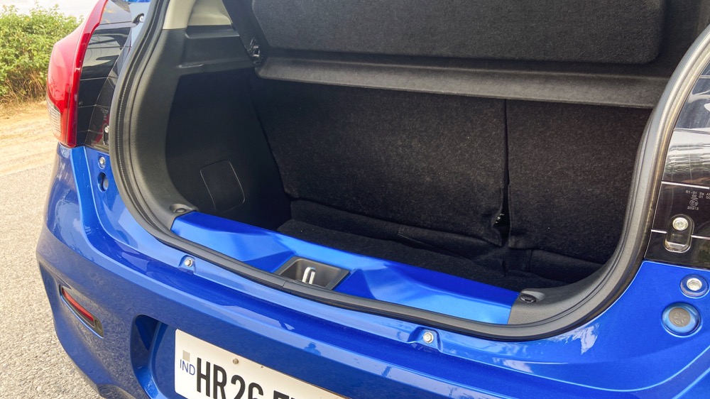
What is impressive is the 313 litre boot. It is pretty deep and will take in quite a bit of luggage. And then rear seats flip forward 60:40 too, freeing up more space. That said, the load lip is high and pretty narrow.

